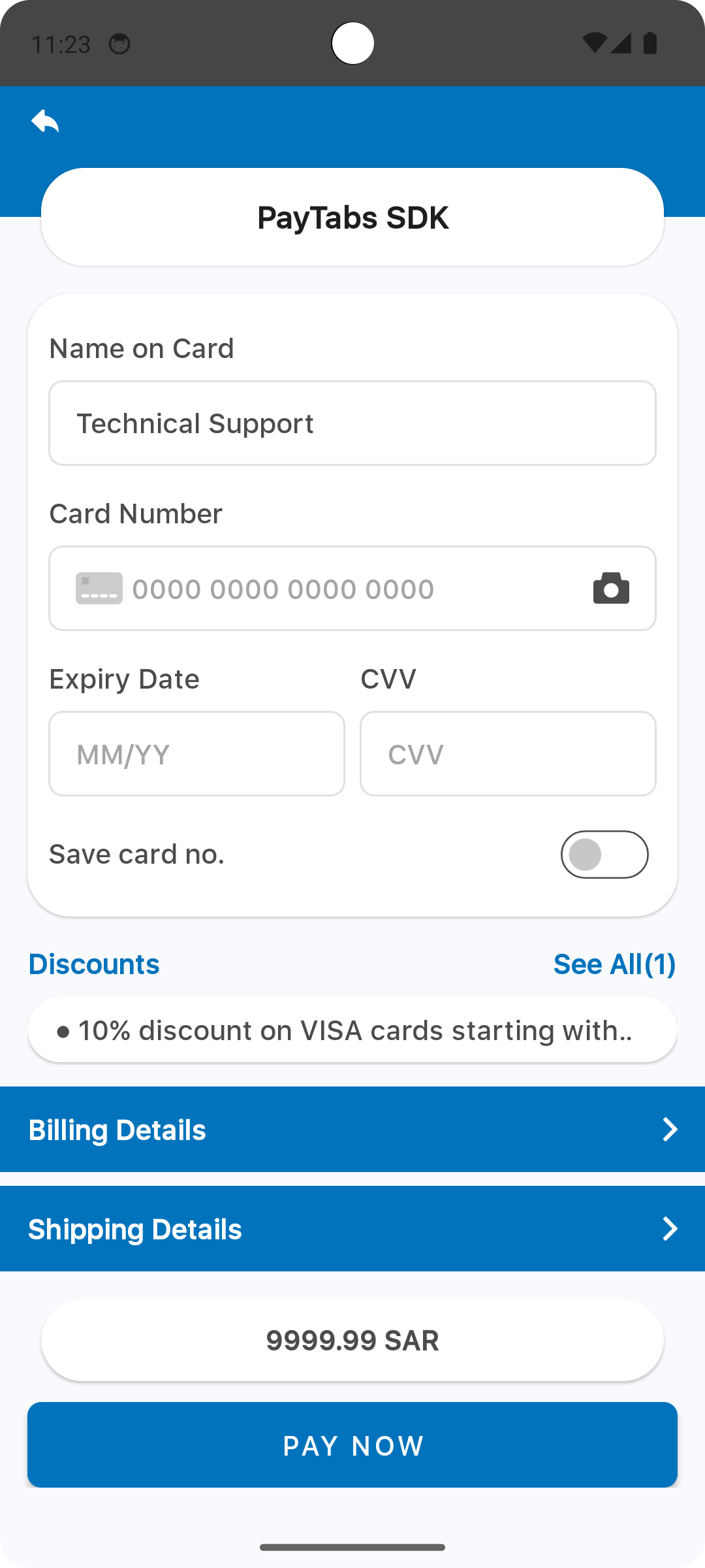
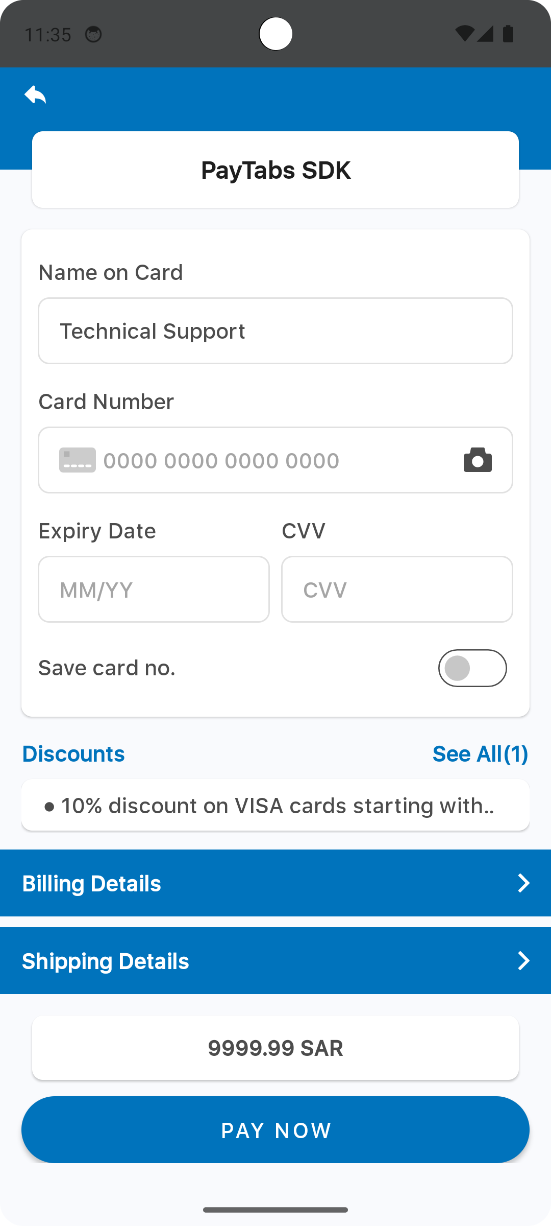
Theme (Overriding)
This article is dedicated to walking you through how to manage the theme in this SDK to be more fit and customized to suit your business needs.
By using the following guide to customize the colors, dimension values (like padding, margins, text sizes), fonts, and logo, you will be configuring the SDK's theme that will be passed to the payment configuration.
Override Colors
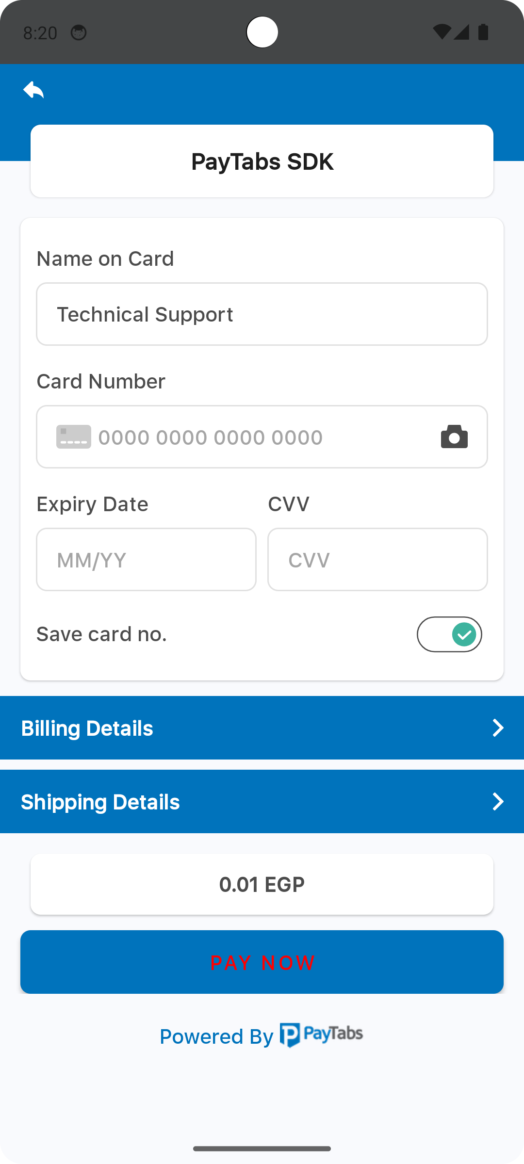
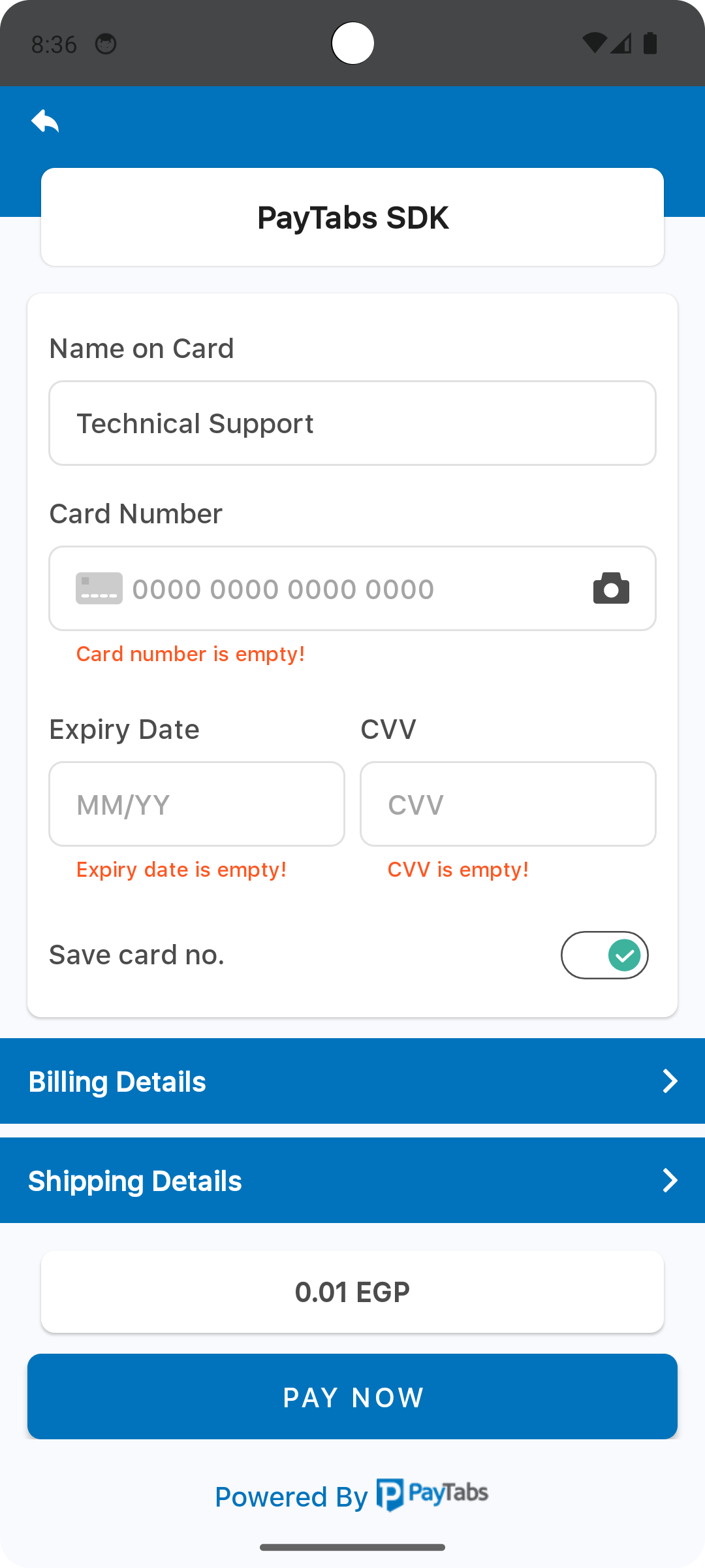
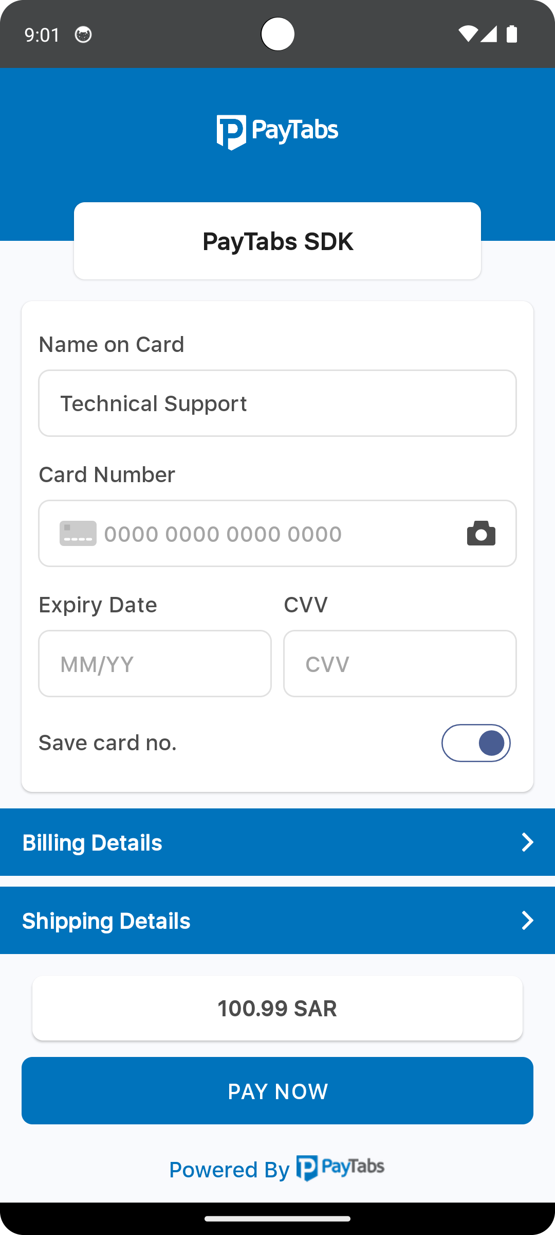
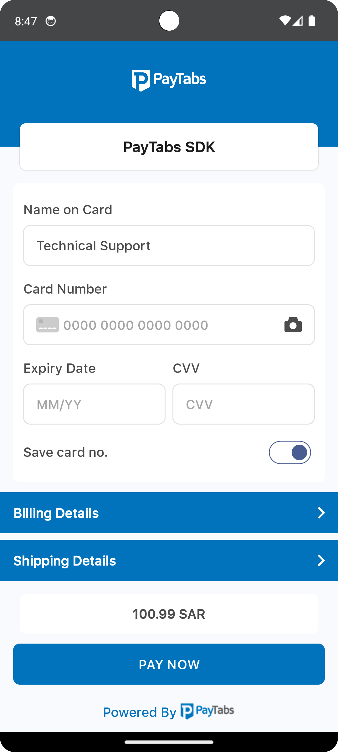
The color resource named payment_sdk_primary_color defines the primary color used across various UI components within the payment SDK. Specifically, this color is applied as the background for the following sections:
- The screen title header, if configured.
- The card input form container.
- The expanded sections of the billing and shipping forms.
- The amount display container.
<?xml version="1.0" encoding="utf-8"?>
<resources>
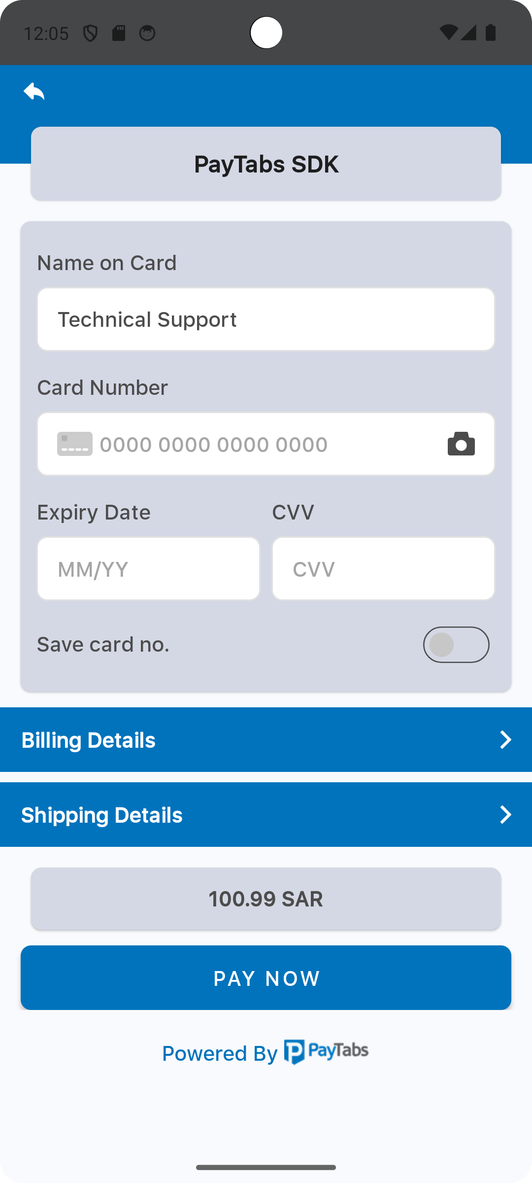
<color name="payment_sdk_primary_color">#d4d8e5</color>
</resources>
Please check the preview using blue gray color #d4d8e5.
The element color with the name payment_sdk_secondary_color is used to set the secondary color, this will be used as a background color for the header background color.
<?xml version="1.0" encoding="utf-8"?>
<resources>
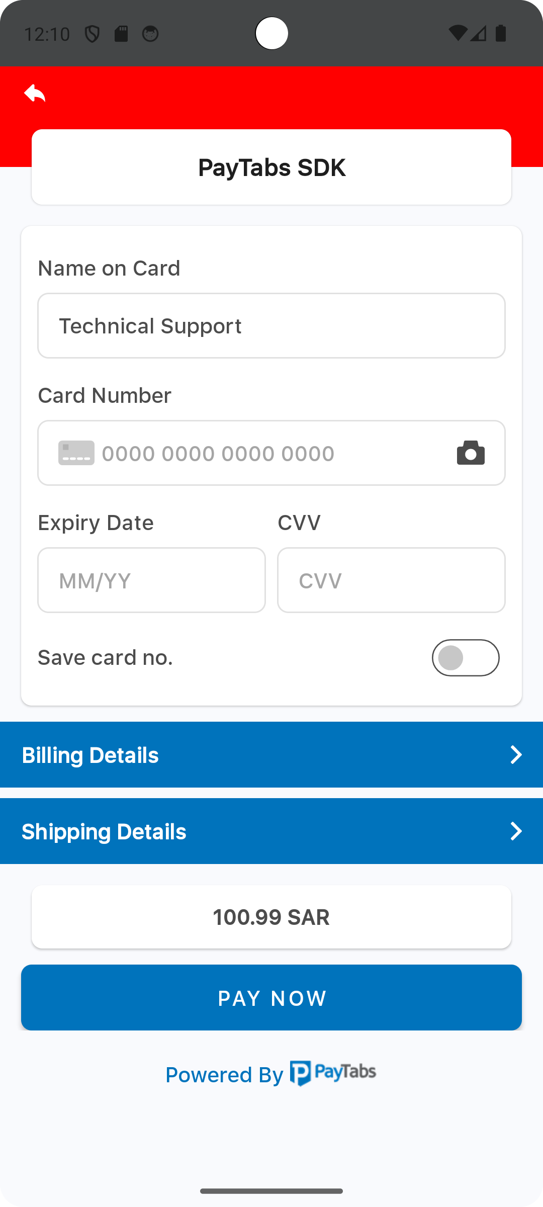
<color name="payment_sdk_secondary_color">#0073bc</color>
</resources>
Please check the preview using red color #ff0000.
The element color with the name payment_sdk_status_bar_color is used to set the status bar background color.
<?xml version="1.0" encoding="utf-8"?>
<resources>
    <color name="payment_sdk_status_bar_color">#444647</color>
</resources>
Please check the preview using red color #ff0000.

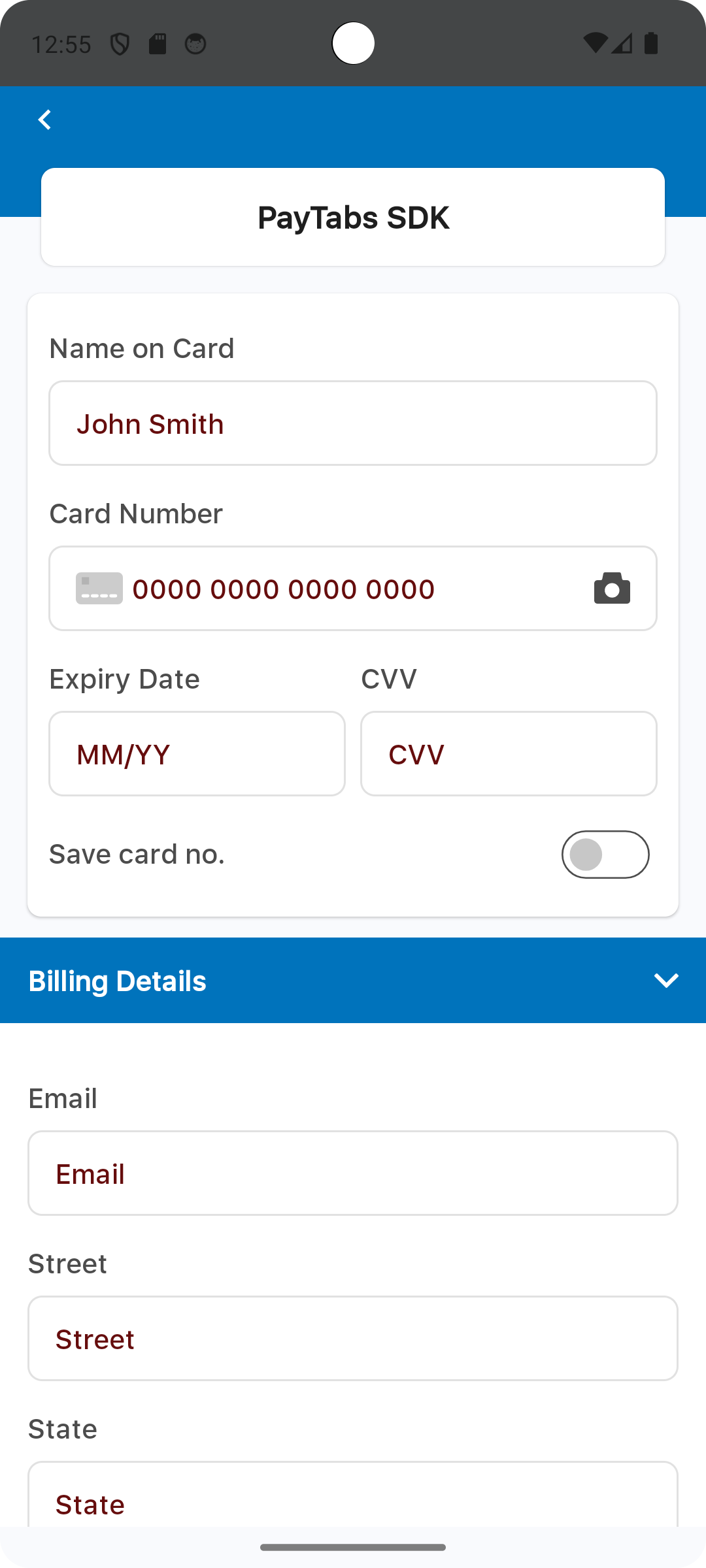
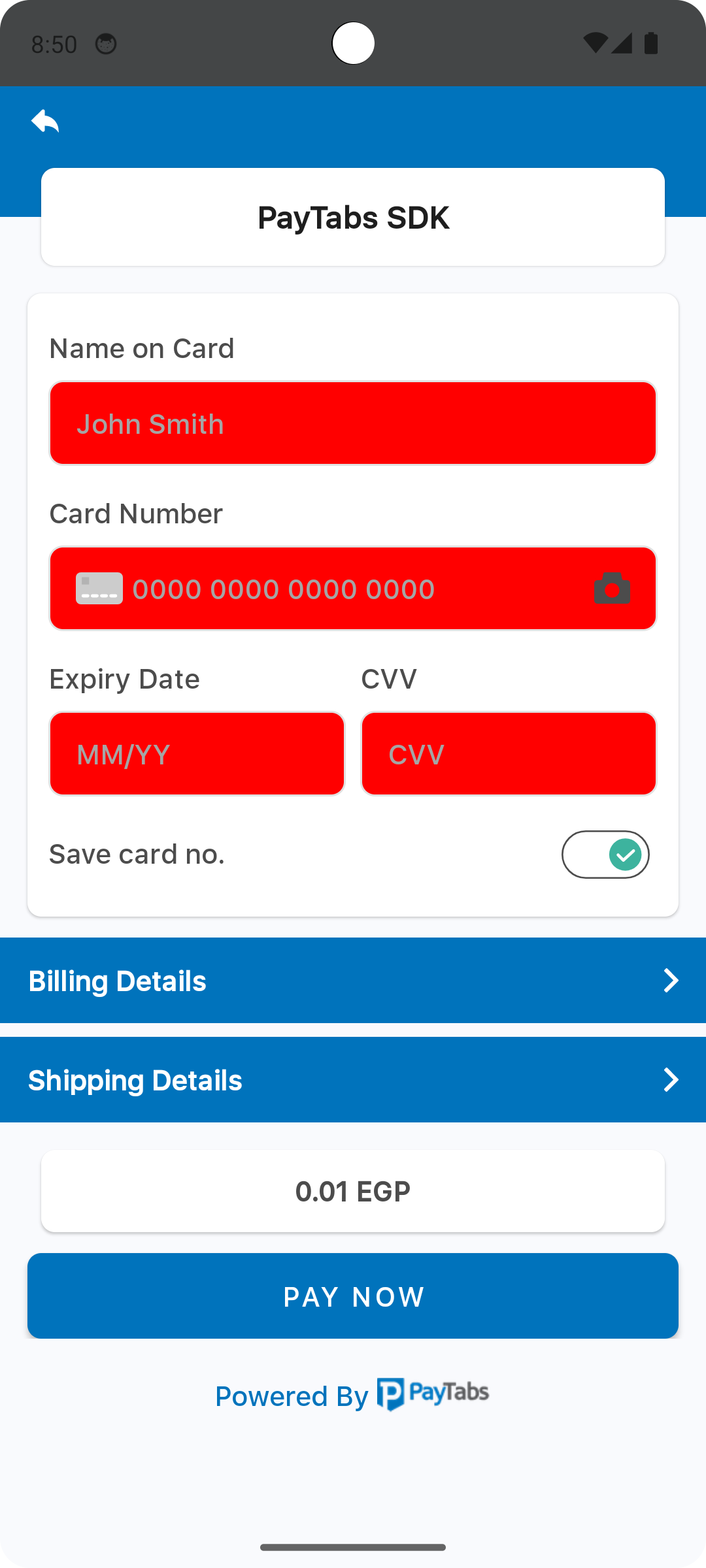
The element color with the name payment_sdk_primary_font_color is used to set the primary font color, this will be used as a font color for:
- Font colors for labels and input values in the card form.
- Defines the font color styles applied to form labels and input field values within the Billing and Shipping Details sections.
- Card Scanner icon color.
<?xml version="1.0" encoding="utf-8"?>
<resources>
    <color name="payment_sdk_primary_font_color">#4c4c4c</color>
</resources>
Please check the preview using dark red color #660D0D.

The element color with the name payment_sdk_secondary_font_color is used to set the secondary color, this will be used as a font color for the footer text.
<?xml version="1.0" encoding="utf-8"?>
<resources>
    <color name="payment_sdk_secondary_font_color">#0073bc</color>
</resources>
Please check the preview using dark red color #660D0D.
The element color with the name payment_sdk_hint_font_color is used to set a text field hint/placeholder font color, this will be used as a font color for:
- Card form hint or placeholder font color.
- Billing and Shipping details text fields hint/placeholder font color.
<?xml version="1.0" encoding="utf-8"?>
<resources>
    <color name="payment_sdk_hint_font_color">#a5a5a5</color>
</resources>
Please check the preview using dark red color #660D0D.
The element color with the name payment_sdk_stroke_color is used to set all text field borders color, this will be used as a border color for:
- Card form text field borders.
- Billing and Shipping details text field borders.
<?xml version="1.0" encoding="utf-8"?>
<resources>
    <color name="payment_sdk_stroke_color">#e1e1e1</color>
</resources>
Please check the preview using red color #ff0000.

The element color with the name payment_sdk_button_text_color, will be used as a font color for the PAY NOW button.
<?xml version="1.0" encoding="utf-8"?>
<resources>
    <color name="payment_sdk_button_text_color">#FFF</color>
</resources>
Please check the preview using red color #ff0000.
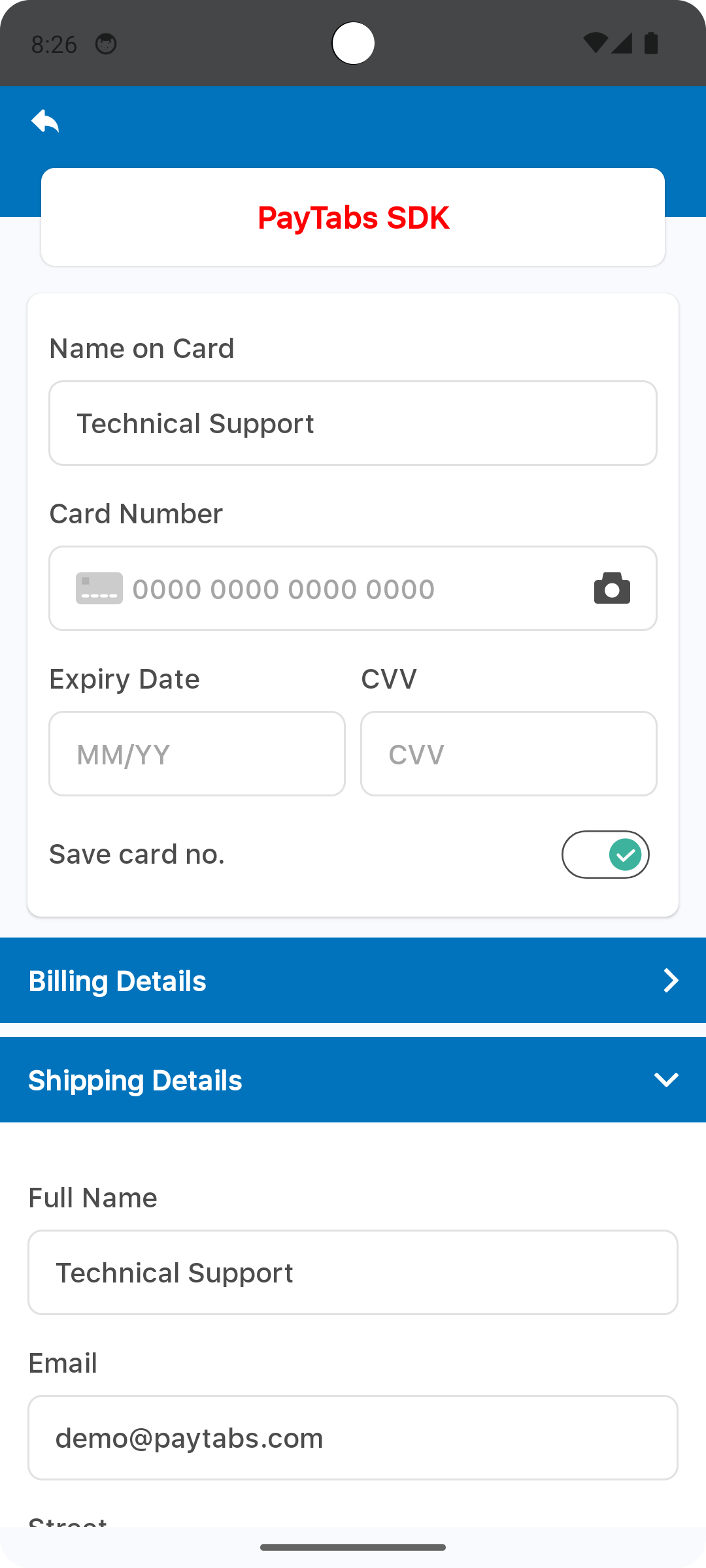
The element color with the name payment_sdk_title_text_color, will be used as a font color for the screen title.
<?xml version="1.0" encoding="utf-8"?>
<resources>
    <color name="payment_sdk_title_text_color">#1e1e1e</color>
</resources>
Please check the preview using red color #ff0000.
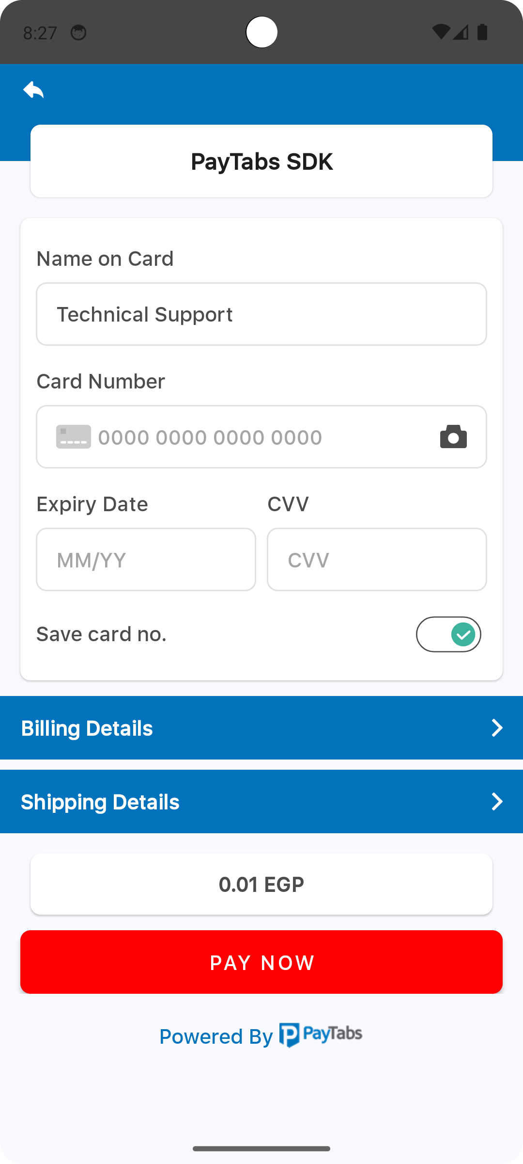
The element color with the name payment_sdk_button_background_color, will be used as a background color for the PAY NOW button.
<?xml version="1.0" encoding="utf-8"?>
<resources>
    <color name="payment_sdk_button_background_color">#0073bc</color>
</resources>
Please check the preview using red color #ff0000.
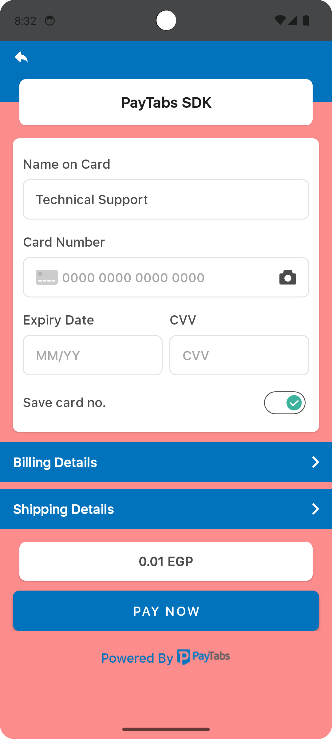
The element color with the name payment_sdk_background_color, will be used as a background color for the screen display..
<?xml version="1.0" encoding="utf-8"?>
<resources>
    <color name="payment_sdk_background_color">#F9FAFD</color>
</resources>
Please check the preview using red color #FD8D8D.
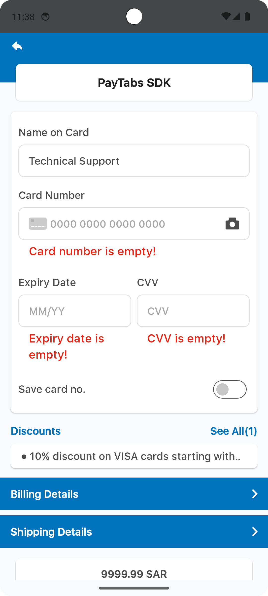
The element color with the name payment_sdk_error_text_color, will be used as a font color for the error text..
<?xml version="1.0" encoding="utf-8"?>
<resources>
    <color name="payment_sdk_error_text_color">#EC2213</color>
</resources>
Please check the preview using red color #FF5722.
The element color with the name payment_sdk_input_field_background_color, will be used as a background color for card form input fields..
<?xml version="1.0" encoding="utf-8"?>
<resources>
    <color name="payment_sdk_input_field_background_color">#FFFFFFFF</color>
</resources>
Please check the preview using red color #ff0000.
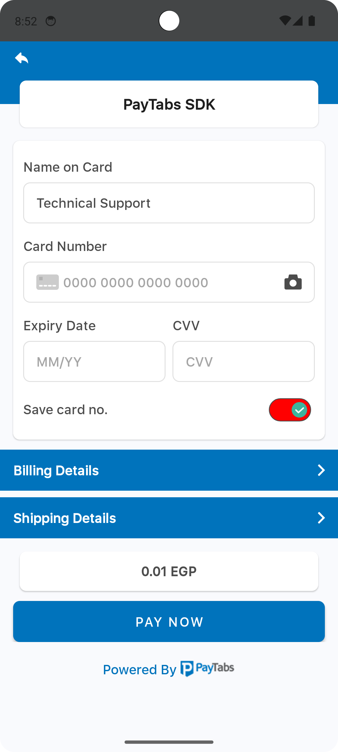
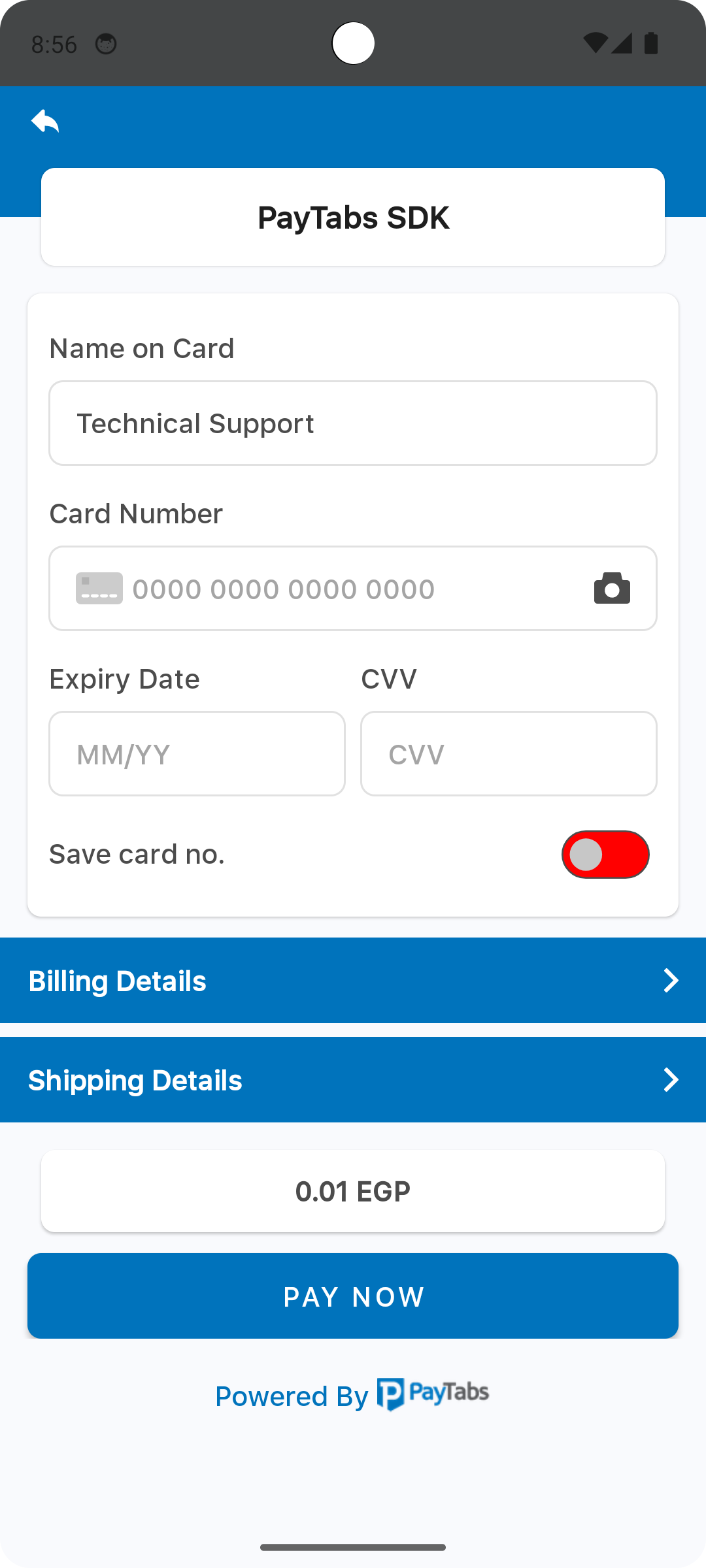
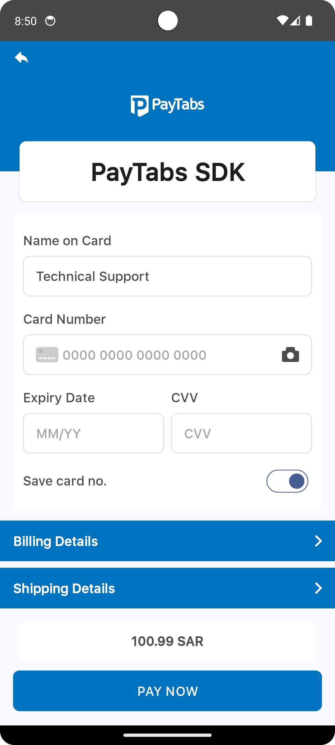
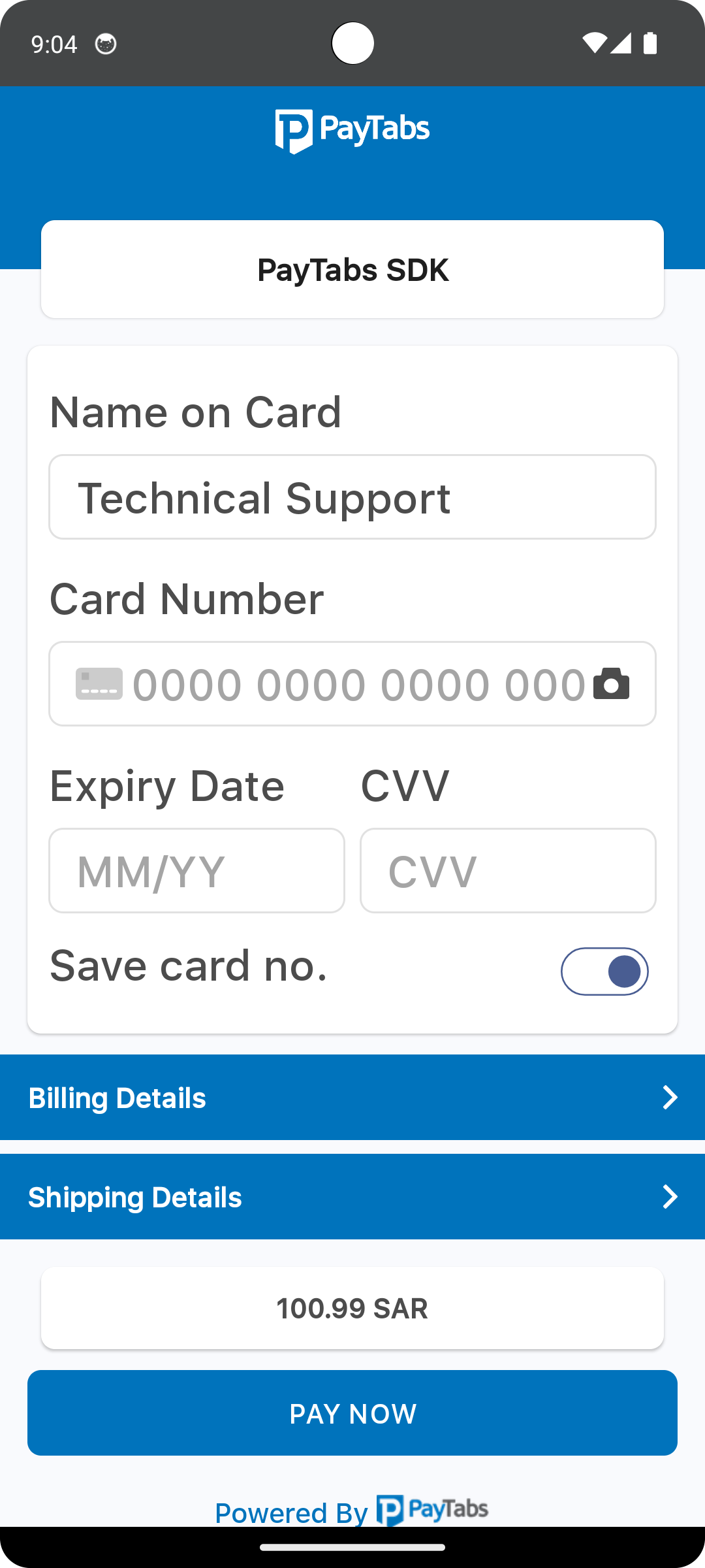
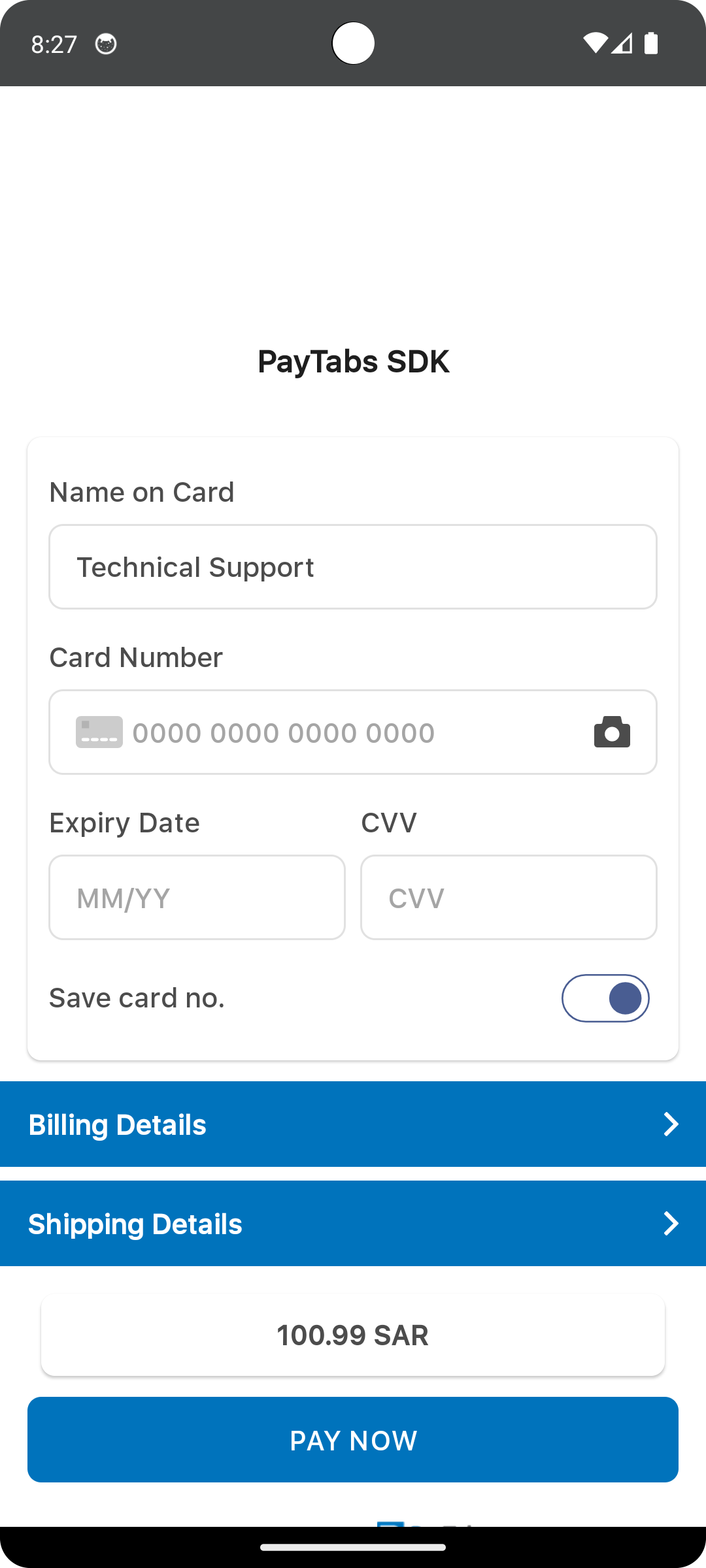
The element color with the name payment_sdk_enabled_switch_track_color, will be used as a background color for the switch track/body in the enabled mode..
Note that Toggle Switch will be appear only if you allowed the saved card token within the configuration..
<?xml version="1.0" encoding="utf-8"?>
<resources>
    <color name="payment_sdk_enabled_switch_track_color">#00000000</color>
</resources>
Please check the preview using red color #ff0000.
The element color with the name payment_sdk_enabled_switch_handle_color, will be used as a color for the switch Handle/Thumb in the enabled mode.
Note that Toggle Switch will be appear only if you allowed the saved card token within the configuration...
<?xml version="1.0" encoding="utf-8"?>
<resources>
    <color name="payment_sdk_enabled_switch_handle_color">#3db39e</color>
</resources>
Please check the preview using red color #ff0000.
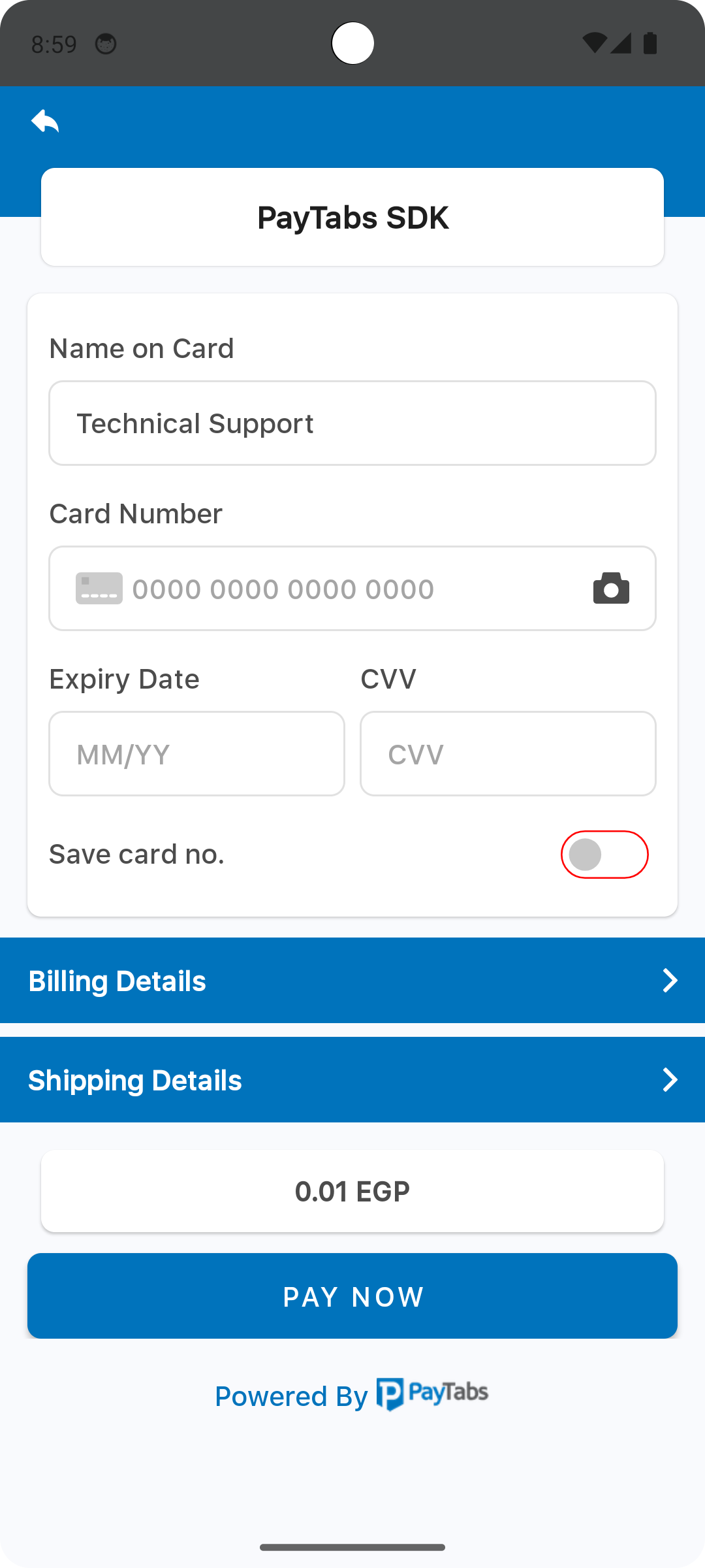
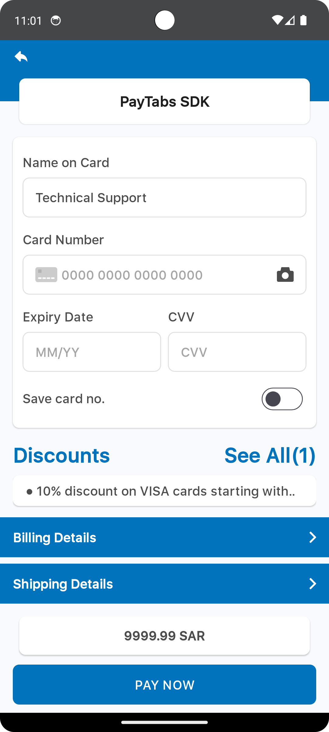
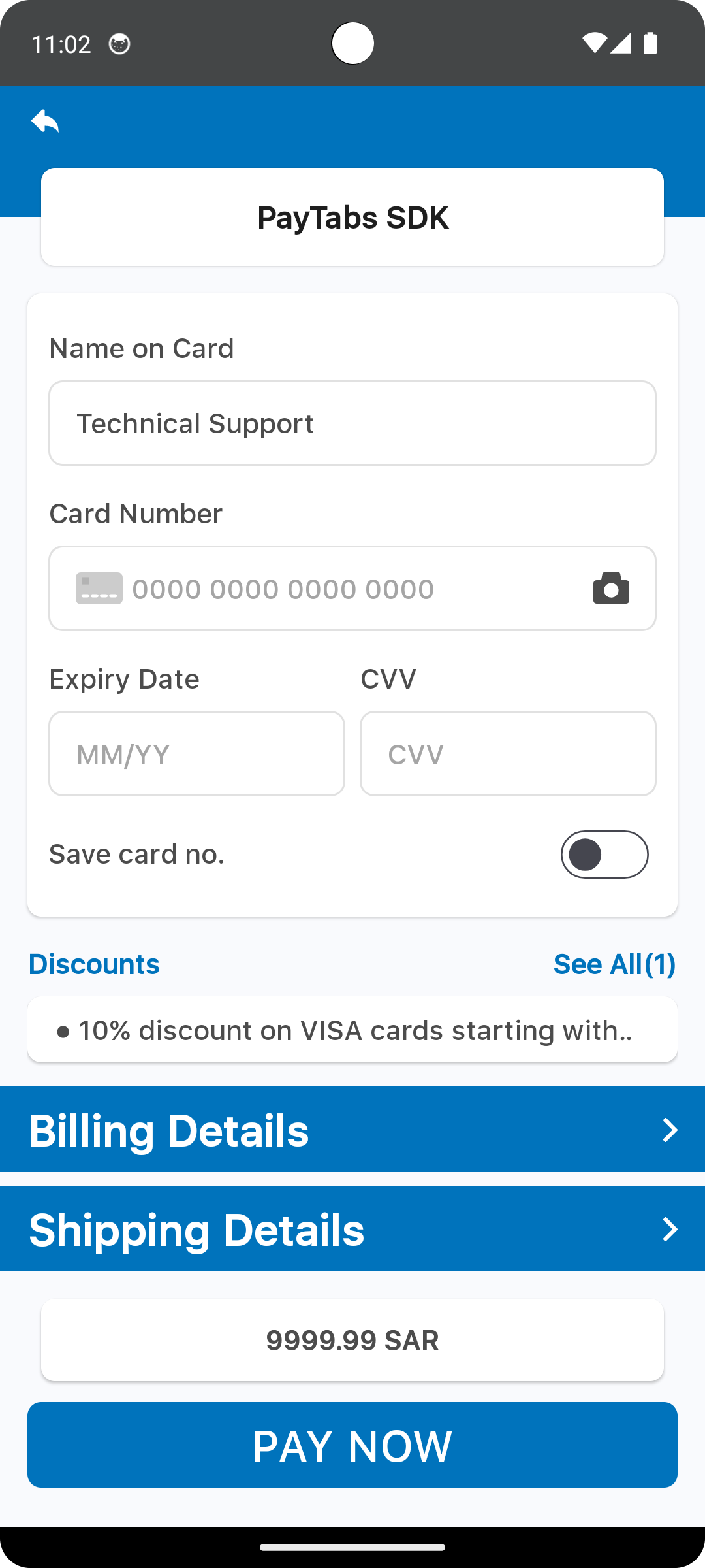
The element color with the name payment_sdk_disabled_switch_track_color, will be used as a background color for the switch track/body in the disabled mode.
Note that Toggle Switch will be appear only if you allowed the saved card token within the configuration..
<?xml version="1.0" encoding="utf-8"?>
<resources>
    <color name="payment_sdk_disabled_switch_track_color">#00000000</color>
</resources>
Please check the preview using red color #ff0000.
The element color with the name payment_sdk_disabled_switch_handle_color, will be used as a color for the switch handle/thumb in the disabled mode.
Note that Toggle Switch will be appear only if you allowed the saved card token within the configuration..
<?xml version="1.0" encoding="utf-8"?>
<resources>
    <color name="payment_sdk_disabled_switch_handle_color">#c7c7c7</color>
</resources>
Please check the preview using red color #ff0000.
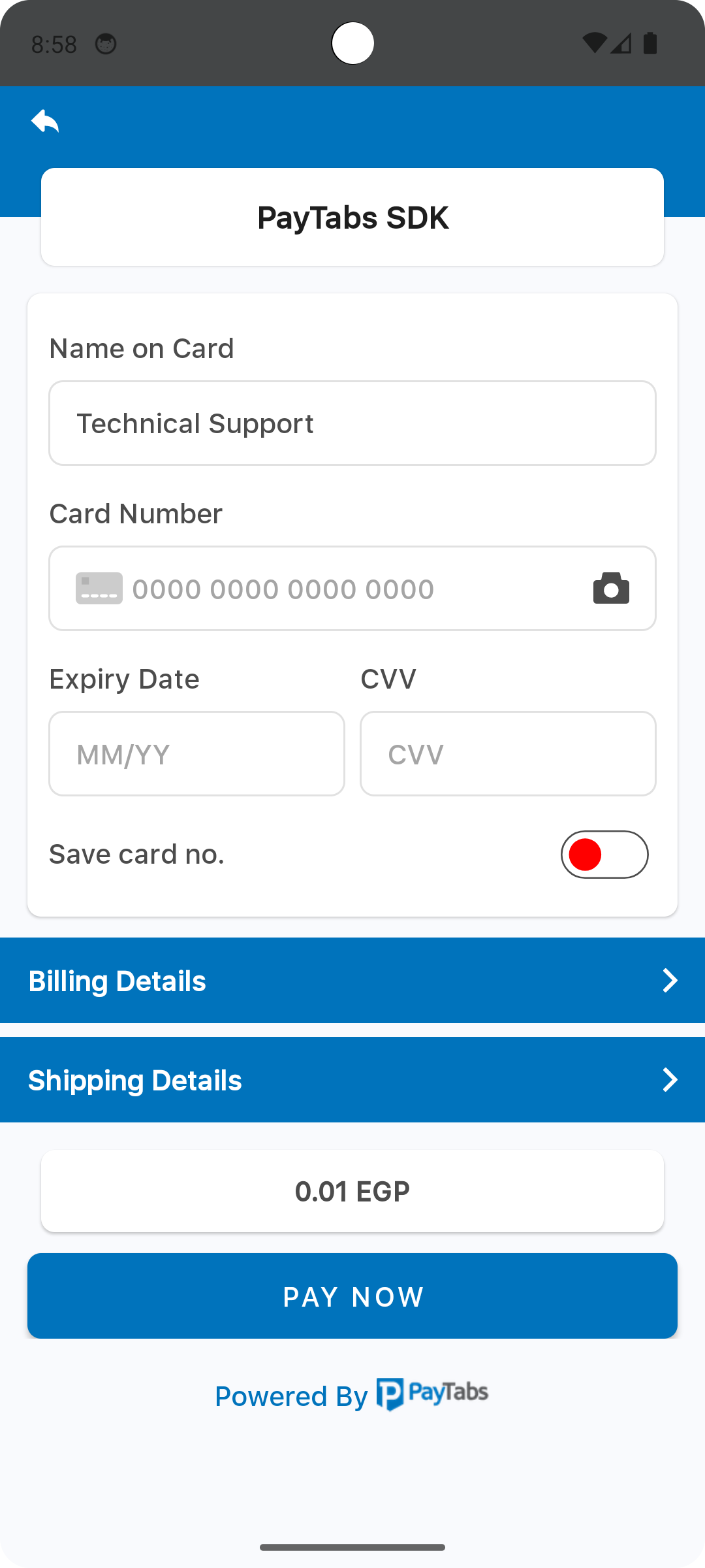
The element color with the name payment_sdk_switch_stroke_color, will be used as a stroke color for the switch.
Note that Toggle Switch will be appear only if you allowed the saved card token within the configuration..
<?xml version="1.0" encoding="utf-8"?>
<resources>
    <color name="payment_sdk_switch_stroke_color">#4c4c4c</color>
</resources>
Please check the preview using red color #ff0000.
The element color with the name payment_sdk_amount_font_color, will be used as a font color for the amount number..
<?xml version="1.0" encoding="utf-8"?>
<resources>
    <color name="payment_sdk_amount_font_color">#4c4c4c</color>
</resources>
Please check the preview using red color #ff0000.
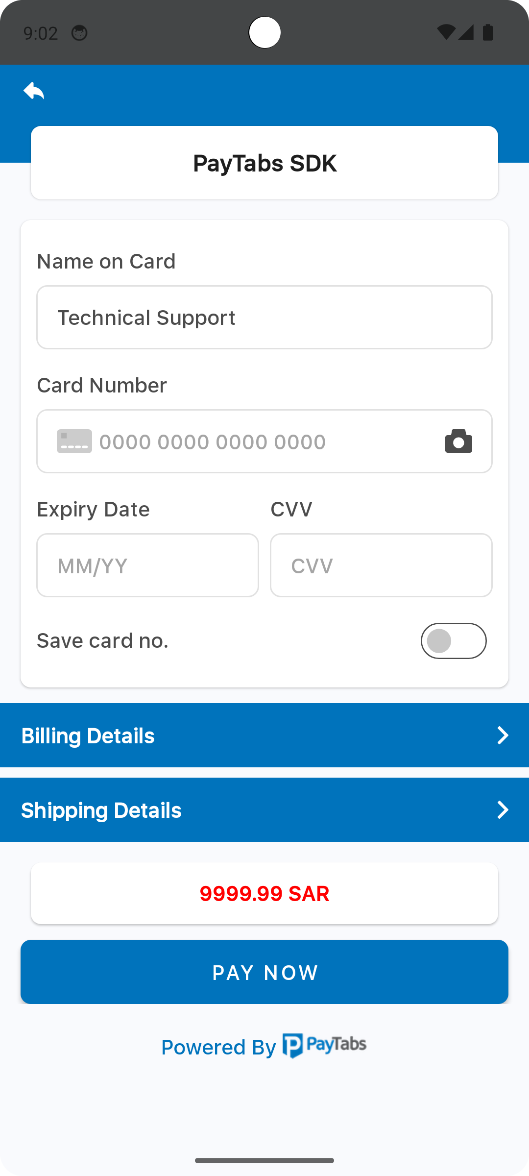
The element color with the name payment_sdk_original_amount_font_color, will be used as a font color for the original amount.
For example: After applying a card discount.
<?xml version="1.0" encoding="utf-8"?>
<resources>
    <color name="payment_sdk_original_amount_font_color">#a5a5a5</color>
</resources>
Please check the preview using red color #ff0000.
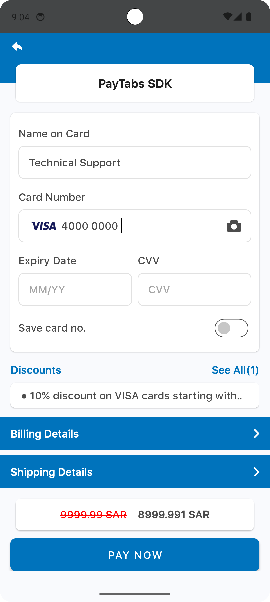
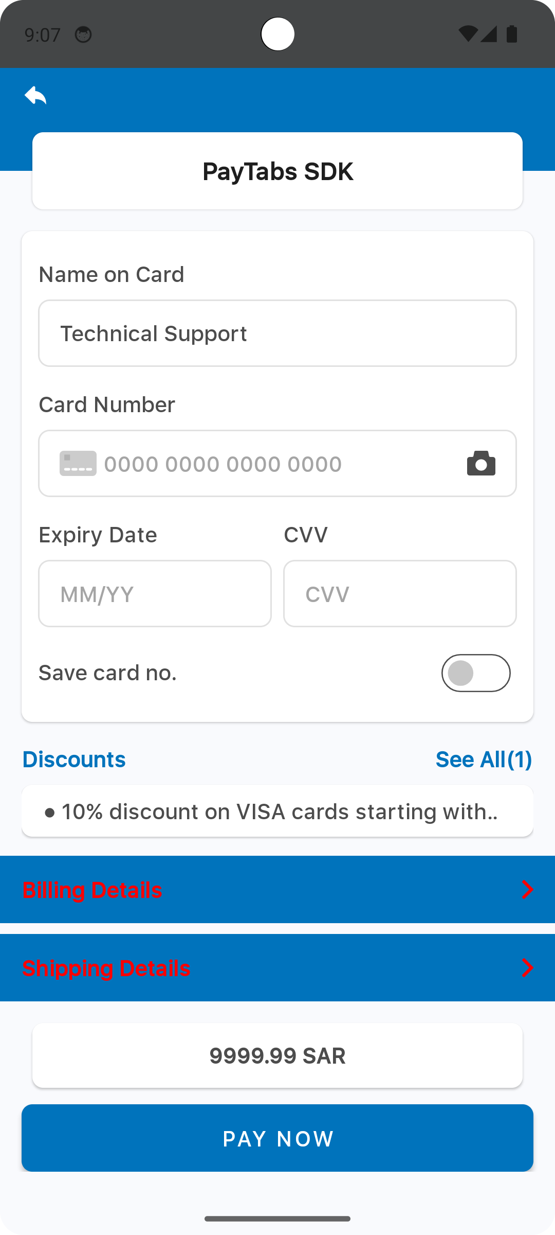
The element color with the name payment_sdk_billing_header_background_color, will be used as a background color for the Billing/Shipping details title section..
<?xml version="1.0" encoding="utf-8"?>
<resources>
    <color name="payment_sdk_billing_header_background_color">#0073bc</color>
</resources>
Please check the preview using red color #ff0000.
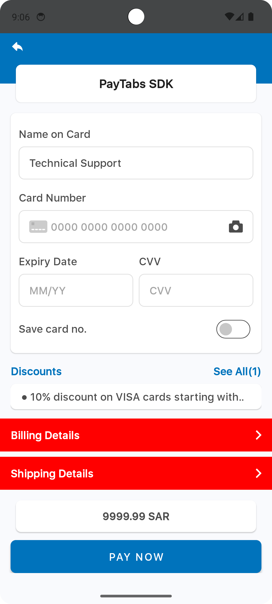
The element color with the name payment_sdk_billing_text_color, will be used as a font color for the Billing/Shipping title..
<?xml version="1.0" encoding="utf-8"?>
<resources>
    <color name="payment_sdk_billing_text_color">#FFF</color>
</resources>
Please check the preview using red color #ff0000.
Override Dimension
The dimension resource named payment_sdk_title_font_size defines the title font size.
<?xml version="1.0" encoding="utf-8"?>
<resources>
    <dimen name="payment_sdk_title_font_size">30dp</dimen>
</resources>
Please check the preview using the font size 30dp.
The dimension resource named payment_sdk_title_margin defines the title section margin from the left and right of the screen.
<?xml version="1.0" encoding="utf-8"?>
<resources>
    <dimen name="payment_sdk_title_margin">55dp</dimen>
</resources>
Please check the preview using the margin value 55dp.
The dimension resource named payment_sdk_primary_font_size defines the primary font size used across various UI components within the payment SDK. Specifically, applied for the following text:
- The card input form container.
- The expanded sections of the billing and shipping forms.
<?xml version="1.0" encoding="utf-8"?>
<resources>
    <dimen name="payment_sdk_primary_font_size">25sp</dimen>
</resources>
Please check the preview using the font size 25sp.
The dimension resource named payment_sdk_secondary_font_size defines the primary font size used across various UI components within the payment SDK. Specifically, applied for the following text:
- The card input form container.
- The expanded sections of the billing and shipping forms.
<?xml version="1.0" encoding="utf-8"?>
<resources>
    <dimen name="payment_sdk_secondary_font_size">25sp</dimen>
</resources>
Please check the preview using the font size 25sp.
The dimension resource named payment_sdk_button_font_size defines the primary font size used across various UI components within the payment SDK. Specifically, applied for the following text:
- The card input form container.
- The expanded sections of the billing and shipping forms.
<?xml version="1.0" encoding="utf-8"?>
<resources>
    <dimen name="payment_sdk_button_font_size">25sp</dimen>
</resources>
Please check the preview using the font size 25sp.
The dimension resource named payment_sdk_input_corner_radius defines the primary font size used across various UI components within the payment SDK. Specifically, applied for the following text:
- The card input form container.
- The expanded sections of the billing and shipping forms.
<?xml version="1.0" encoding="utf-8"?>
<resources>
    <dimen name="payment_sdk_input_corner_radius">25sp</dimen>
</resources>
Please check the preview using the font size 25sp.

The dimension resource named payment_sdk_card_corner_radius defines the primary font size used across various UI components within the payment SDK. Specifically, applied for the following text:
- The card input form container.
- The expanded sections of the billing and shipping forms.
<?xml version="1.0" encoding="utf-8"?>
<resources>
    <dimen name="payment_sdk_card_corner_radius">25sp</dimen>
</resources>
Please check the preview using the font size 25sp.
The dimension resource named payment_sdk_card_margin defines the card form margin from the left and right of the screen.
<?xml version="1.0" encoding="utf-8"?>
<resources>
    <dimen name="payment_sdk_card_margin">25sp</dimen>
</resources>
Please check the preview using the font size 8dp.
The dimension resource named payment_sdk_billing_header_corner_radius defines the Billing/Shipping section corner radius.
<?xml version="1.0" encoding="utf-8"?>
<resources>
    <dimen name="payment_sdk_billing_header_corner_radius">25sp</dimen>
</resources>
Please check the preview using the font size 25dp.
The dimension resource named payment_sdk_billing_header_margin defines the Billing/Shipping section margin from the left and right of the screen.
<?xml version="1.0" encoding="utf-8"?>
<resources>
    <dimen name="payment_sdk_billing_header_margin">25sp</dimen>
</resources>
Please check the preview using the value 16dp.
The dimension resource named payment_sdk_button_corner_radius defines the PAY NOW button corner radius.
<?xml version="1.0" encoding="utf-8"?>
<resources>
    <dimen name="payment_sdk_button_corner_radius">25sp</dimen>
</resources>
Please check the preview using the value 25dp.
The dimension resource named payment_sdk_error_font_size defines the font size used for the error messages.
<?xml version="1.0" encoding="utf-8"?>
<resources>
    <dimen name="payment_sdk_error_font_size">25sp</dimen>
</resources>
Please check the preview using the font size 18sp.
The dimension resource named payment_sdk_amount_font_size defines the font size used for the amount number.
<?xml version="1.0" encoding="utf-8"?>
<resources>
    <dimen name="payment_sdk_amount_font_size">25sp</dimen>
</resources>
Please check the preview using the font size 25sp.

Override Strings (Localization)
you can override any of SDK string text, via override the string file, the default string file should be inside the values folder <project-root>/app/src/main/res/values/strings.xml, and each supported local language should be within values-{language code}.
For example for Arabic language the file directory will be:
<project-root>/app/src/main/res/values-ar/strings.xml
Override Styles
Hides the payment screen title background
<?xml version="1.0" encoding="utf-8"?>
<resources>
    <style name="PaymentSdkTheme" parent="Theme.MaterialComponents.NoActionBar">
        <!-- Hides the payment screen title background -->
        <item name="payment_sdk_hideScreenTitleBackground">true</item>
    </style>
</resources>
Sets the alignment of the payment screen title, it can take any of the following values
- start
- end
- center
That will align the screen title according to the screen language direction. For example, for the start value, it will align the title to the left for Latin languages and to the right for Arabic languages.
<?xml version="1.0" encoding="utf-8"?>
<resources>
    <style name="PaymentSdkTheme" parent="Theme.MaterialComponents.NoActionBar">
        <!-- Sets the alignment of the payment screen title [start-end-center] -->
        <item name="payment_sdk_screenTitleAlignment">start</item>
    </style>
</resources>
On the current preview, the screen title is aligned to the start.
Hides the card and button shadows
<?xml version="1.0" encoding="utf-8"?>
<resources>
    <style name="PaymentSdkTheme" parent="Theme.MaterialComponents.NoActionBar">
        <!-- Hides the card and button shadows -->
        <item name="payment_sdk_hideViewsShadow">true</item>
    </style>
</resources>
Fonts
Add your custom font files with the following fonts names:
payment_sdk_primary_font.ttf
payment_sdk_secondary_font.ttf
Drawables
To override the back button icon, add your drawable file with the name:
payment_sdk_back_arrow.xml
Change the back button arrow
Replace the default back button arrow with your own drawable one.
<vector xmlns:android="http://schemas.android.com/apk/res/android"
  android:width="60dp"
  android:height="60dp"
  android:viewportWidth="60"
  android:viewportHeight="60">
<path
    android:fillColor="#FFFFFFFF"
    android:pathData="M12,9.059V6.5c0,-0.256 -0.098,-0.512 -0.293,-0.708C11.512,5.597 11.256,5.5 11,5.5s-0.512,0.097 -0.707,0.292L4,12l6.293,6.207C10.488,18.402 10.744,18.5 11,18.5s0.512,-0.098 0.707,-0.293S12,17.755 12,17.5v-2.489c2.75,0.068 5.755,0.566 8,3.989v-1C20,13.367 16.5,9.557 12,9.059z"/>

          </vector>
Dark theme
To apply your custom dark theme, you can change the resource color file colors.xml within the folder values-night:
Night mode
set all the colors for the dark/night theme, and the default colors will be overridden by the new ones.
<?xml version="1.0" encoding="utf-8"?>
<resources>
      <color name="payment_sdk_primary_color">#121212</color>
      <color name="payment_sdk_secondary_color">#2196F3</color>
      <color name="payment_sdk_status_bar_color">#000000</color>
      <color name="payment_sdk_primary_font_color">#FFFFFF</color>
      <color name="payment_sdk_secondary_font_color">#90CAF9</color>
      <color name="payment_sdk_hint_font_color">#B0BEC5</color>
      <color name="payment_sdk_stroke_color">#37474F</color>
      <color name="payment_sdk_button_text_color">#FFFFFF</color>
      <color name="payment_sdk_title_text_color">#ECEFF1</color>
      <color name="payment_sdk_button_background_color">#2196F3</color>
      <color name="payment_sdk_background_color">#1E1E1E</color>
      <color name="payment_sdk_blue_F2FAFD">#1A2A3A</color>
      <color name="payment_sdk_error_text_color">#EF5350</color>
      <color name="payment_sdk_back_black_dim">#80000000</color>
      <color name="payment_sdk_input_field_background_color">#1E1E1E</color>
      <color name="payment_sdk_enabled_switch_track_color">#33691E</color>
      <color name="payment_sdk_enabled_switch_handle_color">#66BB6A</color>
      <color name="payment_sdk_disabled_switch_track_color">#263238</color>
      <color name="payment_sdk_disabled_switch_handle_color">#757575</color>
      <color name="payment_sdk_switch_stroke_color">#B0BEC5</color>
      <color name="payment_sdk_amount_font_color">#FFFFFF</color>
      <color name="payment_sdk_original_amount_font_color">#B0BEC5</color>
      <color name="payment_sdk_billing_header_background_color">#1565C0</color>
      <color name="payment_sdk_billing_text_color">#FFFFFF</color>
</resources>