Theme (Overriding)
This article is dedicated to walking you through how to manage the theme in this SDK to be more fit and customized to suit your business needs.
By using the following guide to customize the colors, fonts,logo, etc. You will be configuring the SDK's theme that will be passed to the payment screen page.
Override Theme attributes.
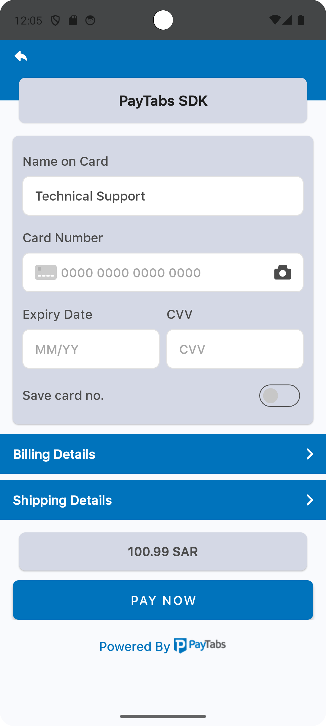
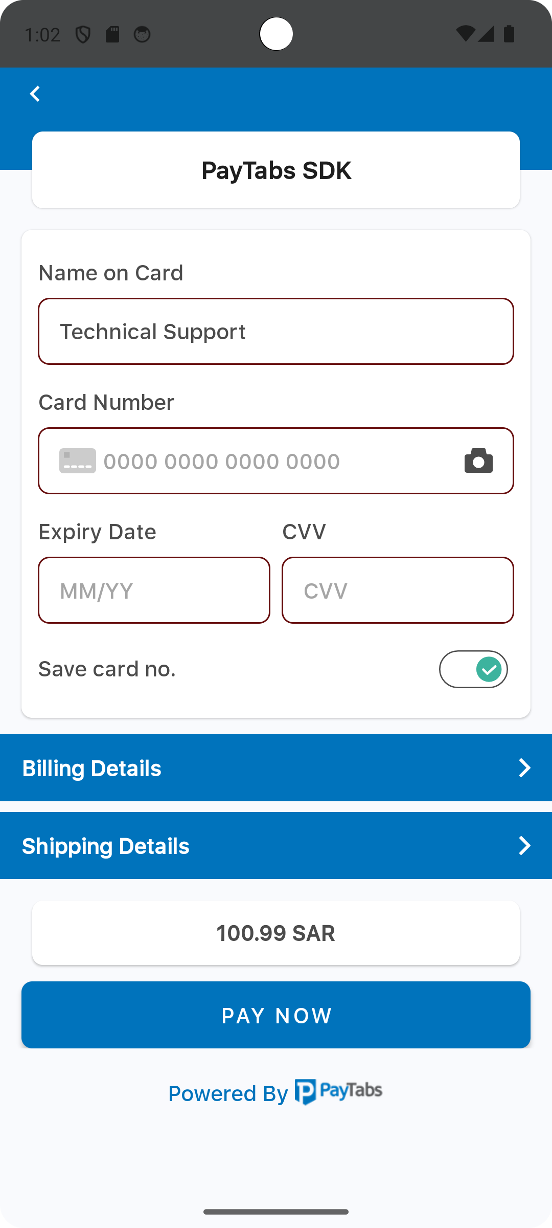
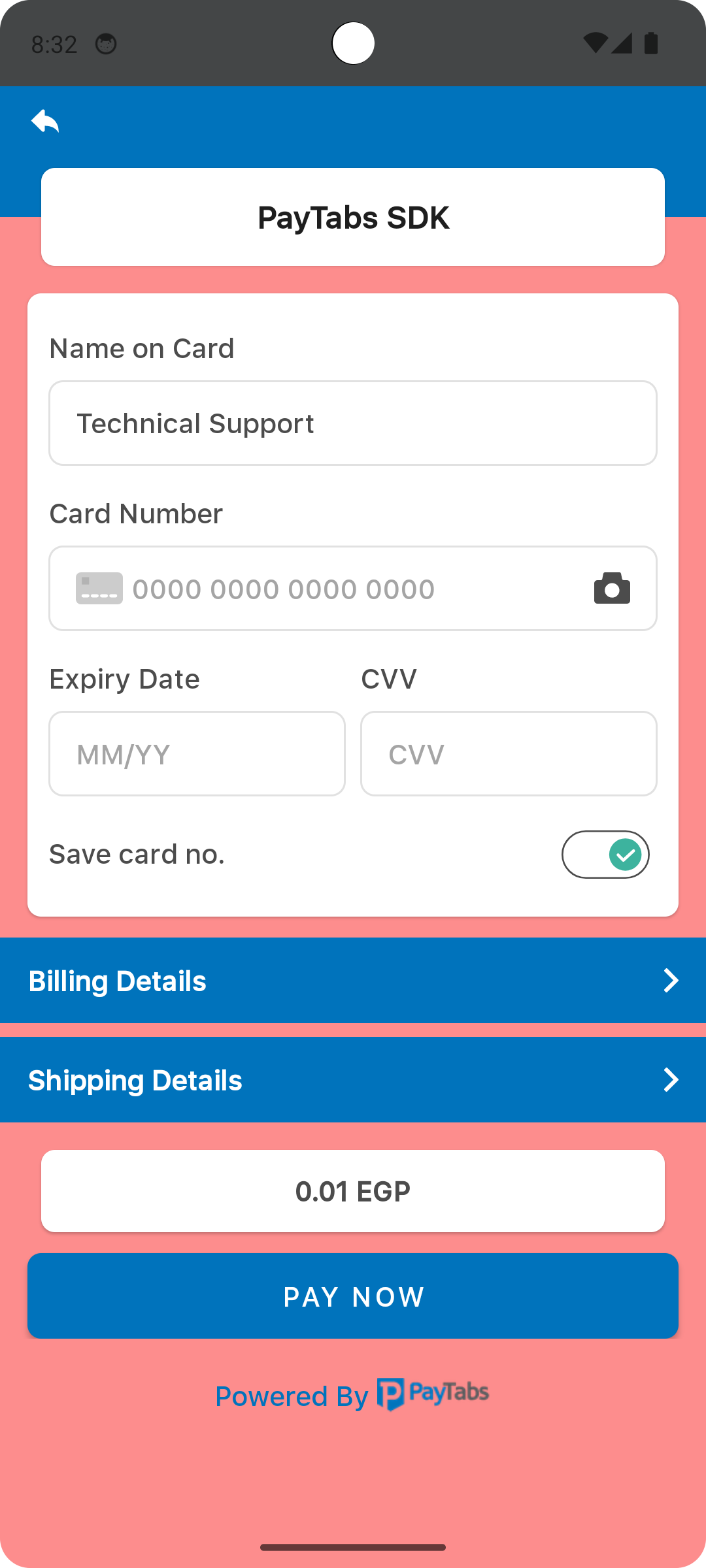
The property named primaryColor defines the primary color used across various UI components within the payment SDK. Specifically, this color is applied as the background for the following sections:
- The screen title header, if configured.
- The card input form container.
- The expanded sections of the billing and shipping forms.
- The amount display container.
// 1. Initialize the Theme
let theme = PaymentSDKTheme.default

// // 2. Customize the theme
theme.primaryColor = .lightGray
Please check the preview using light Gray color.
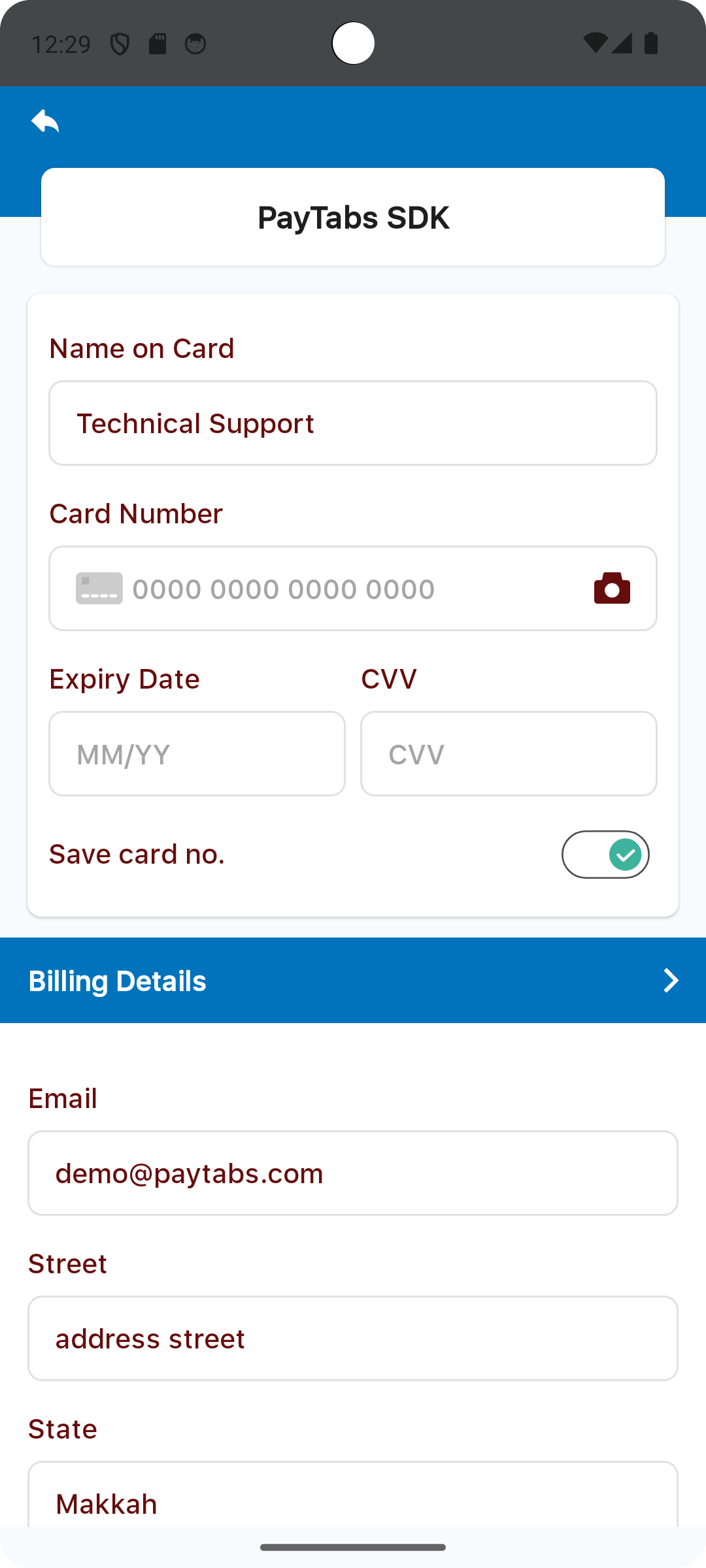
The property named primaryFontColor is used to set the primary font color, this will be used as a font color for:
- Font colors for labels and input values in the card form.
- Defines the font color styles applied to form labels and input field values within the Billing and Shipping Details sections.
- Card Scanner icon color.
// 1. Initialize the Theme
let theme = PaymentSDKTheme.default

// // 2. Customize the theme
theme.primaryFontColor = .red
Please check the preview using red color.
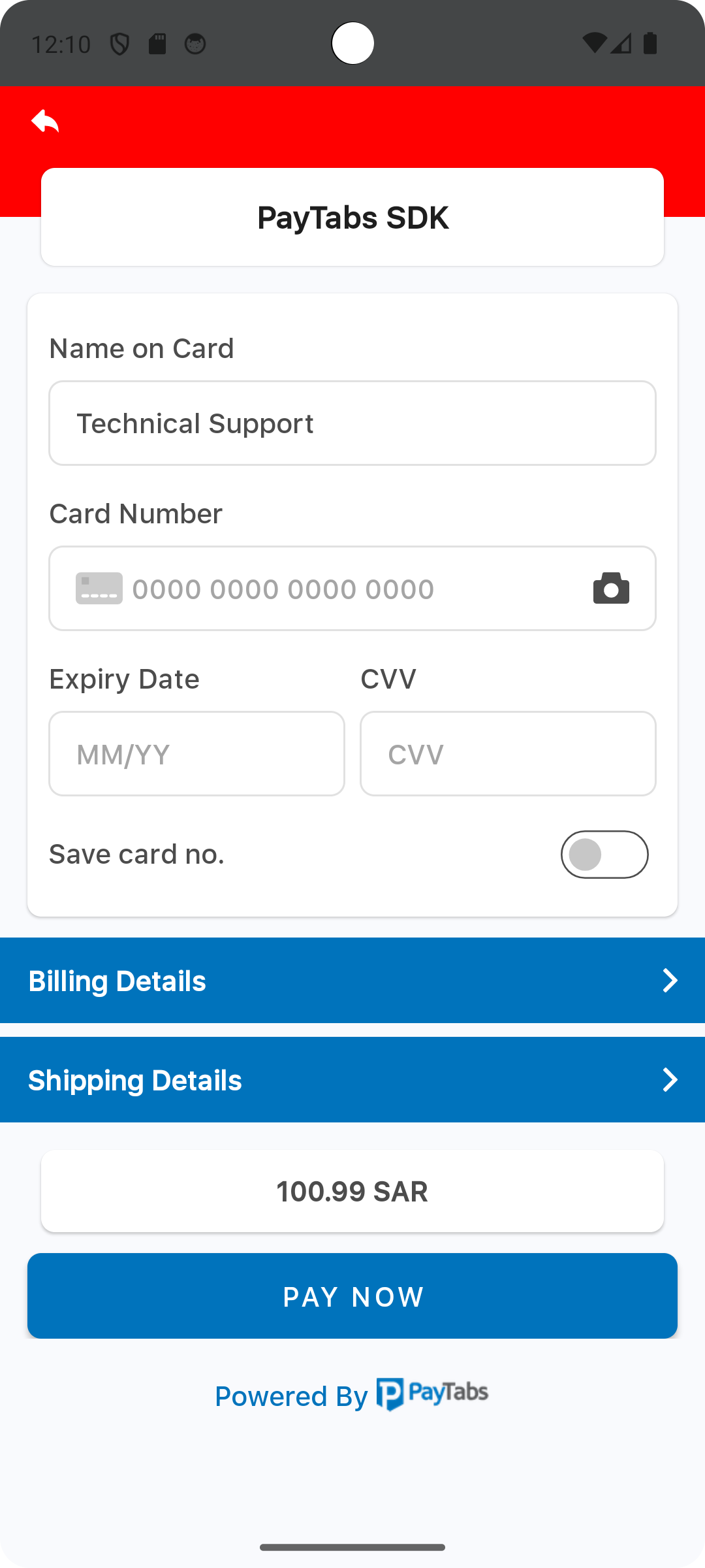
The property named secondaryColor is used to set the secondary color, this will be used as a background color for the header background color.
// 1. Initialize the Theme
let theme = PaymentSDKTheme.default

// // 2. Customize the theme
theme.secondaryColor = .red
Please check the preview using red color.
The property named secondaryFontColor is used to set the secondary color, this will be used as a font color for the footer text.
// 1. Initialize the Theme
let theme = PaymentSDKTheme.default

// // 2. Customize the theme
theme.secondaryFontColor = .red
Please check the preview using red color.
The property named strokeColor is used to set all text field borders color, this will be used as a border color for:
- Card form text field borders.
- Billing and Shipping details text field borders.
// 1. Initialize the Theme
let theme = PaymentSDKTheme.default

// // 2. Customize the theme
theme.strokeColor = .red
Please check the preview using red color.
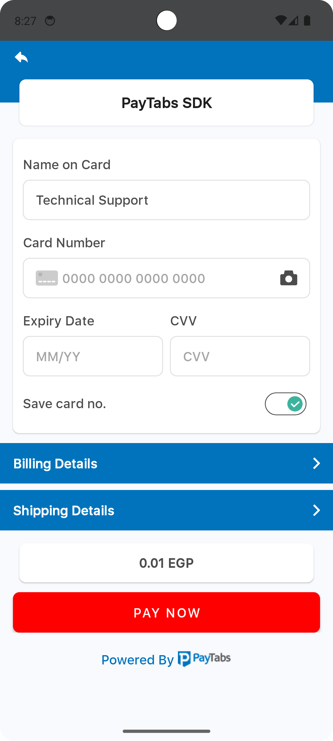
The property named buttonColor, will be used as a background color for the PAY NOW button.
// 1. Initialize the Theme
let theme = PaymentSDKTheme.default

// // 2. Customize the theme
theme.buttonColor = .red
Please check the preview using red color.
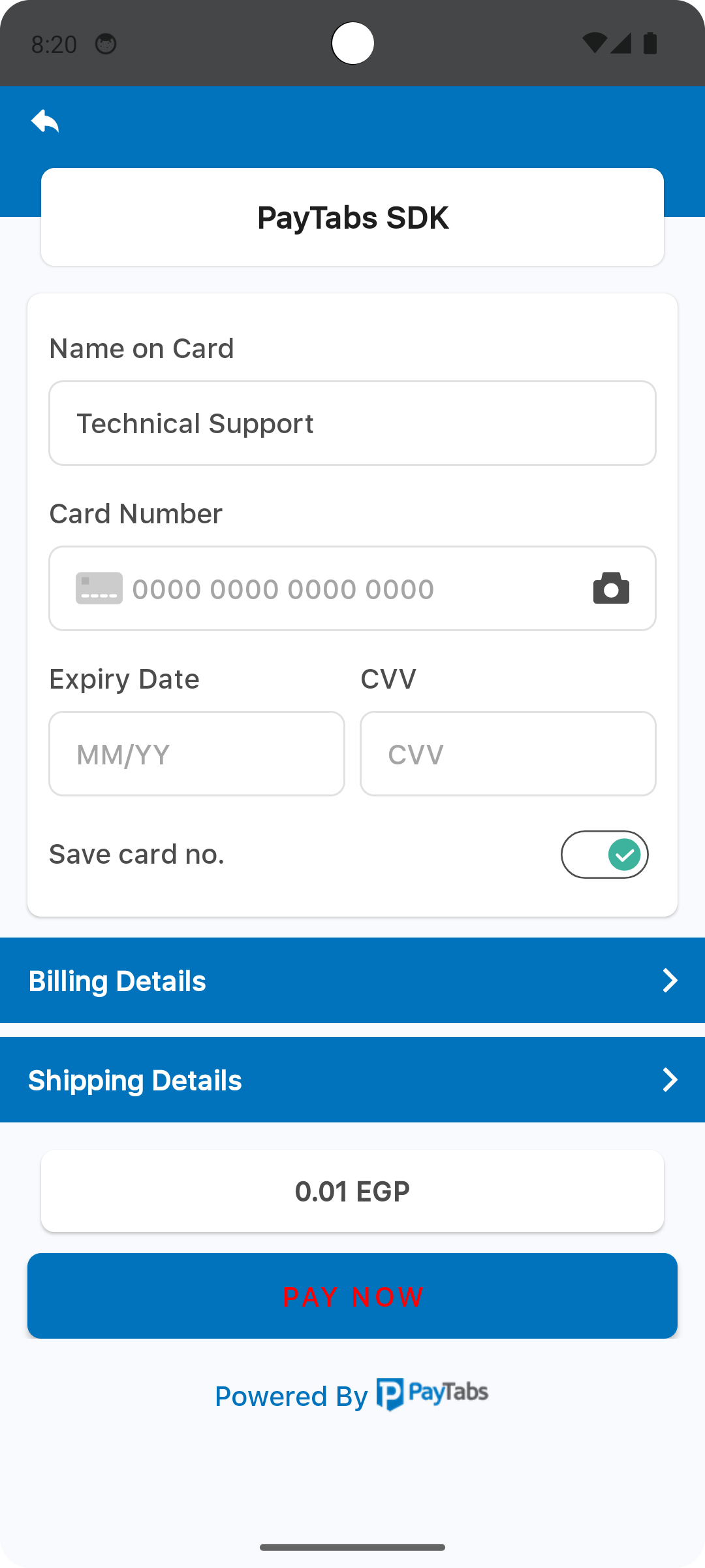
The property named buttonFontColor, will be used as a font color for the PAY NOW button.
// 1. Initialize the Theme
let theme = PaymentSDKTheme.default

// // 2. Customize the theme
theme.buttonFontColor = .red
Please check the preview using red color.
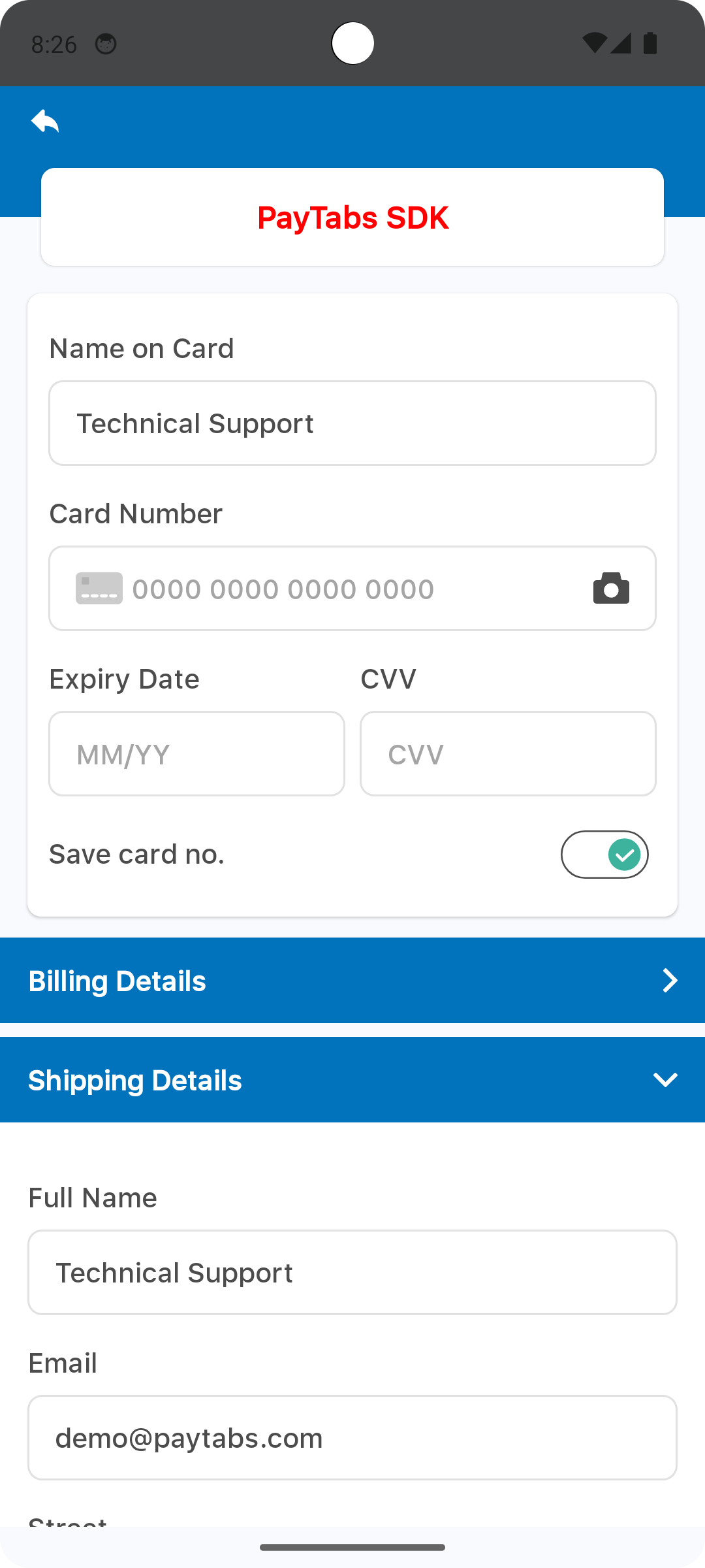
The property named titleFontColor, will be used as a font color for the screen title.
// 1. Initialize the Theme
let theme = PaymentSDKTheme.default

// // 2. Customize the theme
theme.titleFontColor = .red
Please check the preview using red color.
The property named backgroundColor, will be used as a background color for the screen display..
// 1. Initialize the Theme
let theme = PaymentSDKTheme.default

// // 2. Customize the theme
theme.backgroundColor = .red
Please check the preview using red color.
Override Strings (Localization)
you can override any of SDK string text, via override the string file, the default string file should be inside the values folder <project-root>/app/src/main/res/values/strings.xml, and each supported local language should be within values-{language code}.
For example for Arabic language the file directory will be:
<project-root>/<languageCode>.strings, for example: en.strings
Fonts
Add your custom font files with the following fonts names:
payment_sdk_primary_font.ttf
payment_sdk_secondary_font.ttf
Dark theme
You can handle this via set color, for example, PrimColor, as shown below::
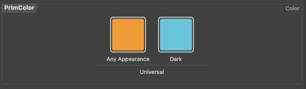
Then assign this color to the attribute you want, and the color will change according to the mode:
theme.primaryColor = UIColor(named: "PrimColor ");